There’s something magical about building in VR. Imagine being able to assemble weightless car engines, arrange dynamic virtual workspaces, or create imaginary castles with infinite bricks. Arranging or assembling virtual objects is a common scenario across a range of experiences, particularly in education, enterprise, and industrial training—not to mention tabletop and real-time strategy gaming.
Guest Article by Barrett Fox & Martin Schubert
Barrett is the Lead VR Interactive Engineer for Leap Motion. Through a mix of prototyping, tools and workflow building with a user driven feedback loop, Barrett has been pushing, prodding, lunging, and poking at the boundaries of computer interaction.
Martin is Lead Virtual Reality Designer and Evangelist for Leap Motion. He has created multiple experiences such as Weightless, Geometric, and Mirrors, and is currently exploring how to make the virtual feel more tangible.
Barrett and Martin are part of the elite Leap Motion team presenting substantive work in VR/AR UX in innovative and engaging ways.
For our latest interaction sprint, we explored how building and stacking interactions could feel seamless, responsive, and stable. How could we place, stack, and assemble virtual objects quickly and accurately while preserving the nuance and richness of a proper physics simulation?
The Challenge
Manipulating physically simulated virtual objects with your bare hands is an incredibly complex task. This is one of the reasons we developed the Leap Motion Interaction Engine, whose purpose is to make the foundational elements of grabbing and releasing virtual objects feel natural.
Nonetheless, the precise rotation, placement, and stacking of physics-enabled objects—while very much possible—takes a deft touch. Stacking in particular is a good example.
Stacking in VR shouldn’t feel like bomb defusal.
When we stack objects in the physical world, we keep track of many aspects of the tower’s stability through our sense of touch. Placing a block onto a tower of objects, we feel when and where the held block makes contact with the structure. In that instant we feel actual physical resistance.
The easiest way to counteract these issues in VR is to disable physics and simply move the objects around. This successfully eliminates unintended collisions and accidental nudges.
With gravity and inertia disabled, we can assemble the blocks however we want, but it lacks the realistic physics-based behavior which is an important part of how we would do the same task in the real world.
However, this solution is far from ideal, as precise rotation, placement, and alignment are still challenging. Moreover, disabling physics on virtual objects makes interacting with them far less compelling. There’s an innate richness to physically simulated virtual interactions in VR/AR that’s only amplified when you can use your bare hands.
A Deployable Scaffold
The best VR/AR interaction design often combines cues from the real world with the unique possibilities of the medium. Investigating how we make assembling things in the physical world easier, we looked at things like rulers and measuring tapes for alignment and the concept of scaffolding, a temporary structure used to support materials in aid of construction.
 Snappable grids are a common feature of flat-screen 3D applications. Even in VR we see early examples like the very nice implementation in Google Blocks.
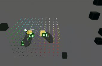
However, rather than covering the whole world in a grid, we proposed the idea of using them as discrete volumetric tools. This would be a temporary, resizable three-dimensional grid which would help create assemblies of virtual objects—a deployable scaffold! As objects are placed into the grid, they would snap into position and be held by a physics spring, maintaining physical simulation throughout the interaction. Once a user was done assembling, they could deactivate the grid. This releases the springs and returns the objects to unconstrained physics simulation.
To create this scaffolding system we needed to build two components: (1) a deployable, resizable, and snappable 3D grid, and (2) an example set of objects to assemble.
Generating A 3D Grid
Building the visual grid around which Scaffold interactions are centered is straightforward. But since we want to be able to change the dimensions of a Scaffold dynamically, we may have many of them per Scaffold (and potentially multiple Scaffolds per scene). To optimize, we created a custom GPU-instanced shader to render the points in our Scaffold grid. This type of repetitive rendering of identical objects is great to put onto the GPU because it saves CPU cycles and keeps our framerate high.
In the early stages of development it was helpful to color-code the dots. Since the grid will be dynamically resized, colors are helpful to identify what we’re destroying and recreating or whether our dot order is orderly (also it was pretty and we like rainbow things).
Shader-Based Grid Hover Affordance
In our work we strive to make things reactive to our actions—heightening the sense of presence and magic that makes VR such a wonderful medium. VR lacks many of the depth cues that we rely on in the physical world, so reactivity is also important in boosting proprioception (our sense of the relative positions of different parts of our body).
With that in mind, we didn’t stop at simply making a grid of cubes. Since we render our grid points with a custom shader, we could add features to our shader to help users better understand the position and depth of their hands. With that in mind, our grid points will grow and glow when your hand is near, making it more responsive and easy to use.
Making Scaffold-Reactive Blocks & Their Ghosts
Creating objects that can be placed within (and aligned to) our new grid starts with adding an InteractionBehaviour component to one of our block models. Combined with the Interaction Engine, this takes care of the important task of making the object graspable. To empower the block to interact with the grid, we created and added another Monobehaviour component that we called ScaffoldBehaviour. This behavior handles as much of the block-specific logic as possible so the grid classes stay less complicated and remain wieldy (yes, it’s a word).
As with the grid itself, we’ve learned to think about the affordances for our interactions right along with the interactions themselves. We designed interaction logic to create and manage a ghost of the block when it’s within the grid, so you can easily tell where the block will go when you release it:
Resizing The Grid with Interaction Engine Handles
By building handles to grasp and drag, a user can resize the Scaffold to fit within a specific area. We created spherical handles with Interaction Engine behaviors, which we constrained to the move in the axis they control. This way, if the user places blocks in the Scaffold and drags the handles to make the grid smaller, the blocks are released, dropping them. Conversely, if the handles are dragged to make the grid larger, and blocks had been placed at those grid points, then the blocks snap back into place!
Continued on Page 3: Widget Stages, States, and Shapes »
The post Exclusive: Scaffolding in VR – Interaction Design for Easy & Intuitive Building appeared first on Road to VR.
Ream more: https://www.roadtovr.com/scaffolding-in-vr-interaction-design-for-easy-intuitive-stacking-and-assembly/
No comments:
Post a Comment